

Custom food packaging design happens in seven stages: the brief, the identity, research, the concept, the dieline with the printer, labels and legal copy, then proof and print. Skip a stage and you usually pay for it at the printer or on the shelf. Here is how we take a small food brand through those stages, with three real projects: Napoli pizza flour, Tissir coffee and Mäyli gelato.
Plain boxes with a label, or custom packaging?
For a first product, a plain box with a label is sometimes the right call. It is fine while you test small runs, when you sell only to other businesses, or as the outer shipping box. Add a branded sticker or a sleeve so it still looks like your brand.
Custom packaging makes sense once the product and the sales channel are confirmed. At that point the pack has a job to do on a shelf or in a feed, and a sticker on a brown box won’t do it. Our packaging design page lists the three situations we see: a new brand built from scratch with the pack included, an existing brand adding a line or fixing a pack for a product that already sells, and a brand whose pack no longer matches what is inside.
Step 1: the brief
Before anyone opens a design file, we need to know: what the product is, where it will be sold (retail, wholesale, online, or a mix), who else is on that shelf, what the budget is, and when it has to be in stores. The two questions first-time brands miss are where the product will be sold and who will print it. Both change the design. Tell us in the project brief and the first call goes faster.
Step 2: identity first, then the pack
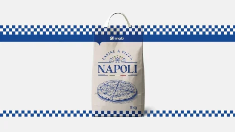
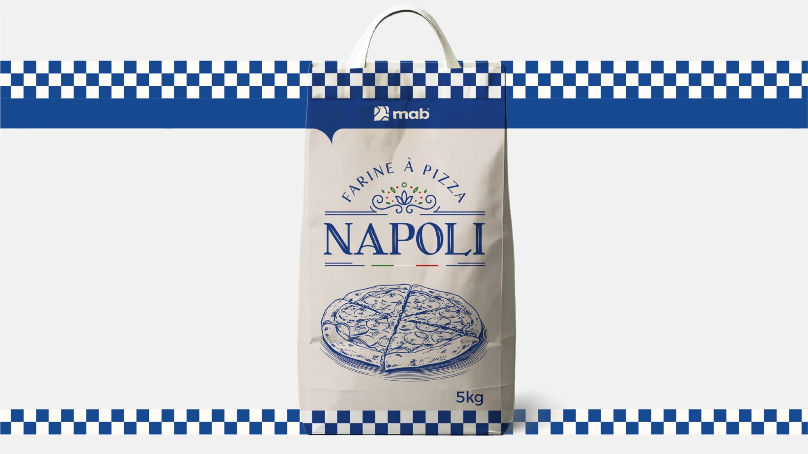
A brand sometimes comes for packaging without a brand that can compete in its category. Packaging built on a weak identity can’t compete, so the identity comes first. For Napoli, the wordmark, the Mediterranean blues and the gingham border are the identity, and the sack is where that identity lives. If you only have a logo, read what a brand identity package should include before briefing a box. Our visual identity page explains what we build at this stage.
Step 3: research and shelf context
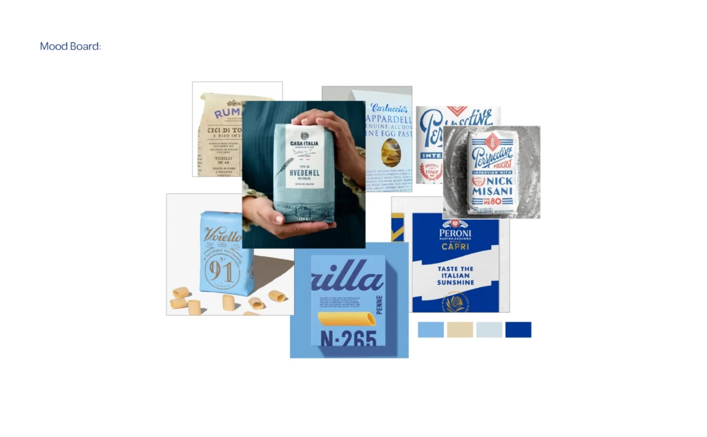
We look at the shelf your product will sit on. For Napoli that meant the generic bulk sacks that fill wholesale stores, and a mood board of flour and pasta packaging with blue color swatches. The question is simple: what does everyone else do, and what would make a buyer notice yours without looking out of place? We wrote eight principles about this in what makes packaging sell.
Step 4: the concept
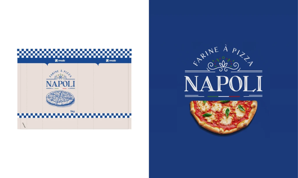
Every pack we design is built on one idea. For Napoli it is the cobalt and white gingham border, which comes from trattoria tablecloths, Neapolitan food culture and Mediterranean blues. The engraved-style pizza illustration and the kraft-textured sack with white panels follow from that idea. For Tissir the idea is a reveal: a minimal exterior in deep crimson or forest green that opens to a warm sand interior lined with spice botanicals. One idea per pack. Sometimes a client suggests something that would not work for their product; we explain why and propose what will.
Step 5: the dieline and the printer
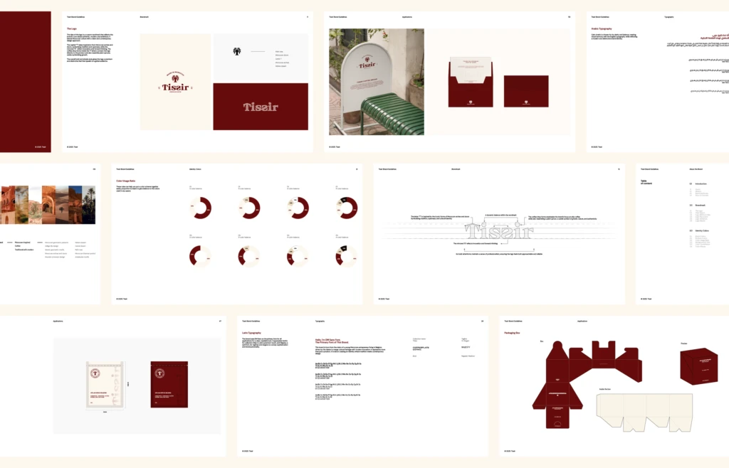
A dieline is the flat template of the box or bag, with every fold and cut line. We work the dieline out with the client’s printer rather than guessing, because each printer has its own machines, tolerances and file requirements. What the printer needs depends on the printer, but the usual list is: print-ready files on their own dieline, CMYK or spot colors, bleed, outlined fonts, and the legal text placed correctly. The Tissir guideline pages carry the box dieline next to the logo, colors and typography, so whoever prints the next run has everything in one place. The Napoli gallery shows the flat bag artwork, which is the file the sack is printed from.
Step 6: labels, legal copy and bilingual packs
The information panel (ingredients, weight, batch, barcode, storage) is planned from the first sketch, so it is not squeezed in at the end. The barcode goes where the printer and the store need it. The text stays readable but quiet, so the front of the pack does the selling.
On a bilingual Arabic and English pack, both languages get equal care. The Arabic is set in a real Arabic typeface, not flipped by software, and the two scripts are designed together so the pack reads as one brand in both.
Step 7: proof, then print
A physical proof is where you find the surprises: a color that prints darker than the screen, a fold that lands on a line of text, a finish that looks different on the real material. We ask for one before the full run. On Tissir there were no surprises at print. That is what the earlier steps are for.
From one product to a range
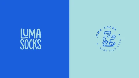
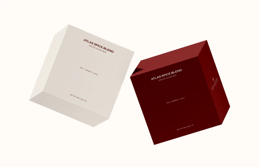
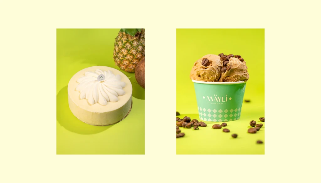
A pack that works for one product should already be built to work for the next. For Mäyli, we solved this while developing the brand system: the wordmark, the waffle-cone square pattern and the color set were built so new flavors and cup sizes fit in without a redesign. Luma Socks is not food, but the principle is the same: the collection boxes and special edition boxes stay one family because the design is aligned with the brand first, and then different formats and designs are tested against it. Tissir’s two Atlas Spice Blend boxes, one cream and one maroon, show the same thing in two colors.
The rule for custom food packaging design across a range: fix the elements that must never change, and decide early which elements change per product.
Wholesale shelf vs retail shelf
A pack for wholesale and B2B has a practical job. It gets stacked, carried, scanned and stored. So it has to be strong, easy to read from a distance, and clear on the basics: product name, weight, batch, barcode, storage. Fewer colors, high contrast, nothing fancy that slows anyone down.
A pack for a supermarket shelf has a different job. A shopper looks at it briefly, from close up, and decides. So the brand, the flavor and the reason to buy come first. Color, appetite appeal, the feel of the material and the finishes matter much more here, and there is room for the brand’s story.
Napoli sits in between: a 5 kg sack for wholesale stores and professional kitchens that still had to stand out next to generic bulk sacks. The new packaging helped the products sell faster.
What the packaging must also carry
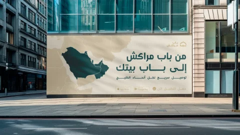
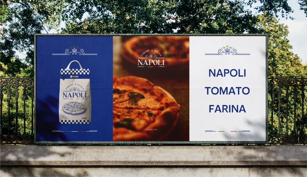
A food pack rarely travels alone. Napoli’s system went onto three roll-up banners, an outdoor billboard and social posts, all built from the same wordmark, blues and gingham. If the pack is designed as part of an identity, the banner is a small job. If it was designed in isolation, the banner is a second project. Our marketing materials page covers this stage.
Mistakes we see on first products
- Designing before knowing where the product will be sold and who will print it
- Too many messages on the front of the pack
- Copying the market leader
- Picking finishes the brand can’t afford when it reprints
One more, which is less a mistake than a boundary: we don’t take on anything unethical or anything that goes against Muslim religious values, and we don’t take on alcohol brands.
Got a product and a shelf in mind and want custom food packaging design that gets to print without surprises? Start a project with a short brief, or book a call.
Frequently asked questions
What are the stages of packaging design?
Brief, research, concept, design development, print-ready artwork on the printer’s dieline, proof, then production.
Should I start with a plain box and a label?
For a first test batch, often yes. Custom packaging makes sense once the product and the sales channel are confirmed.
What does the printer need from the designer?
Print-ready files on the printer’s own dieline: CMYK or spot colors, bleed, outlined fonts, and the legal text placed correctly.
Can one design work for several products?
Yes, if it’s built as a system from the start: fixed elements that stay the same and variable elements that change per product.
Do you design bilingual Arabic and English packaging?
Yes. Both languages are designed together so the pack reads as one brand in both.