



Visual Identity
A visual identity is the set of visual tools a brand uses everywhere: logo, typography, color, patterns, photography and icon style, and the guide that ties them together. We Craft Studio designs complete identity systems, including bilingual Arabic and English logos, and tests them on real applications before anything is final.
A logo is the start, not the identity
A logo on its own rarely carries a brand. What people remember is the system around it: the color they spot from the end of the aisle, the typeface on the menu, the pattern on the bag. We design those pieces together, so each one makes the others easier to recognize.
Built for two scripts
Many of our clients sell in the Gulf or North Africa as well as in Europe or North America. For them we design the Arabic and English lockups as one family, matched in weight, rhythm and spacing, reading right to left and left to right. The Arabic version is never an afterthought set in a default font.
Direction for photos and icons
Art direction for brand imagery is part of the identity. We set the rules for photography (light, color, framing, styling) and draw the icon style, so a product shoot or a new icon a year from now still looks like the same brand, even when someone else makes it.
Tested before it’s final
Before handover, the identity goes onto a website header, business cards, social posts, packaging and the other pieces you’ll actually use. That’s where problems show up (a mark that disappears at 16 pixels, a color that prints muddy on kraft paper), and we fix them while fixing is still cheap.
-
Logo system
A primary logo, secondary versions and a symbol or monogram, with size and clear-space rules that keep it sharp on a pen or a billboard.
-
Bilingual Arabic and English lockups
Both scripts designed as one family, matched in weight and rhythm, so neither version looks like an afterthought.
-
Color palette
Primary and secondary colors with print values (CMYK, Pantone) and screen values (RGB, HEX), so the brand looks the same on kraft paper and on a phone.
-
Typography
A font family and a hierarchy for headlines, body text and small print, in Latin and Arabic.
-
Photography and iconography direction
Rules for light, color, framing and styling in photos, plus an icon style, so every new image and icon stays on-brand.
-
Patterns and graphic elements
Supporting shapes that keep the brand recognizable even when the logo isn't on the page.
-
Application mockups
The identity on a website header, business cards, social posts, packaging and other collateral, so you see it working before you sign off.
-
Brand identity guide and final files
A guide your team, printers and partners can follow, and every final file in the formats you need.
-
Brief
We start from your strategy, or settle the essentials with you in a short workshop.
-
Directions
Distinct creative directions, each shown on real applications rather than on a white page.
-
Refine
One direction, developed in detail through focused rounds of feedback.
-
System and handover
The full identity system, the brand identity guide and the final files, organized so anyone can find what they need.
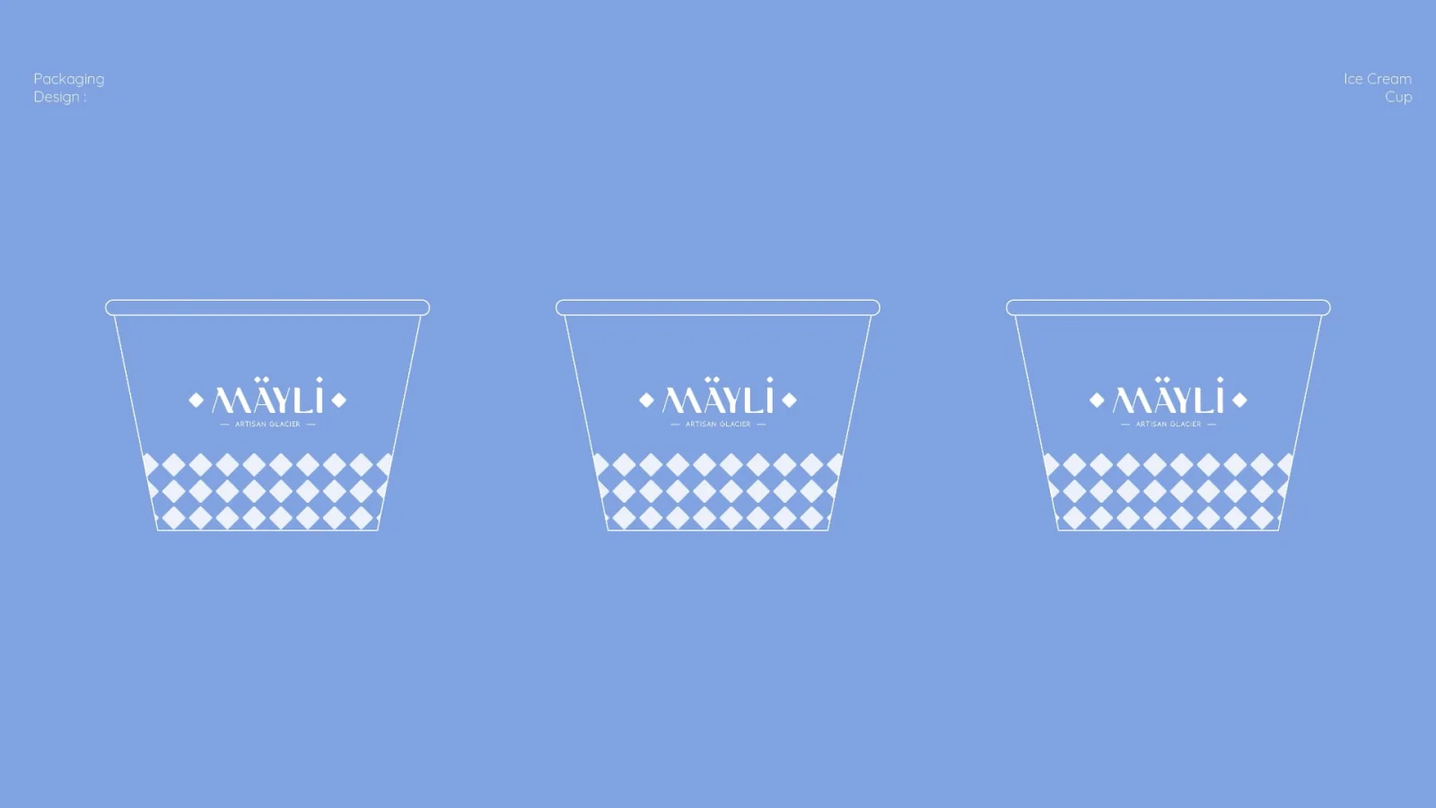
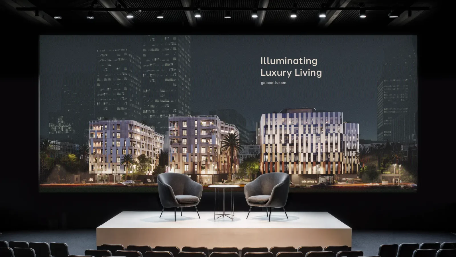
A logo system, typography, a color palette, patterns and graphic elements, direction for photography and icons, application mockups and a brand identity guide that explains how to use them. Final files come in every format you need for print and digital.
A logo is one mark. A visual identity is the whole system around it, including type, color, imagery and usage rules, so the brand looks consistent on packaging, signage, social media and the web.
Yes, we've done it many times. We design both versions together so they match in weight and character, and work right to left and left to right in print and digital.
Yes, as part of the visual identity. We set the direction for photography and icons (light, color, framing, styling) and add it to your brand identity guide, so photographers and designers can follow it after handover.
A focused identity can take a few weeks, while larger systems with many applications take longer. You get a clear schedule in our proposal.
Yes. If your brand has recognition worth keeping, we evolve it: we keep the assets people already know and fix what holds the brand back.
Every brand is different, so we quote after a short discovery call, based on scope.