

A brand identity package is the set of design assets, rules and files a business needs to look like one brand everywhere: on a box, a sign, a website and a social post. A logo is one item in that set. Below is what a complete package contains, shown on real projects we designed, and what to ask for before you sign off.
Logo vs brand identity: what’s the difference?
Clients often come to us with “I just need a logo.” We rarely hand over just a logo, and when the scope really is only a logo, we say so and do it. But a logo alone is not what makes a brand stand out today.
The first call usually starts with three questions, so we understand what the person means. Do they really want only a logo, or do they not yet know how to say what they need? Usually the answers show they need more than a mark.
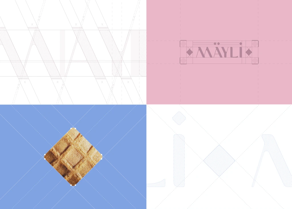
Here is why. A logo is one shape. It can’t tell a cup from a billboard, it can’t decide how a menu is typeset, and it can’t make a bag recognizable from the end of an aisle. The identity is the system around the logo: the versions of it, the colors, the typefaces, the graphic elements, the applications and the rules that keep them consistent. For Mäyli, a gelato brand, the wordmark does part of the work and a waffle-cone square pattern does the rest. On a cup you may only see the pattern, and you still know whose cup it is.
What a complete package includes
Brand strategy
Positioning, target audience, brand personality, brand voice and tone (how the brand talks), and key messages. This is the part people skip when they ask for a logo, and it is the part that decides whether the logo means anything. Brand strategy comes first in our process, because every design choice after it needs a reason.
Logo system
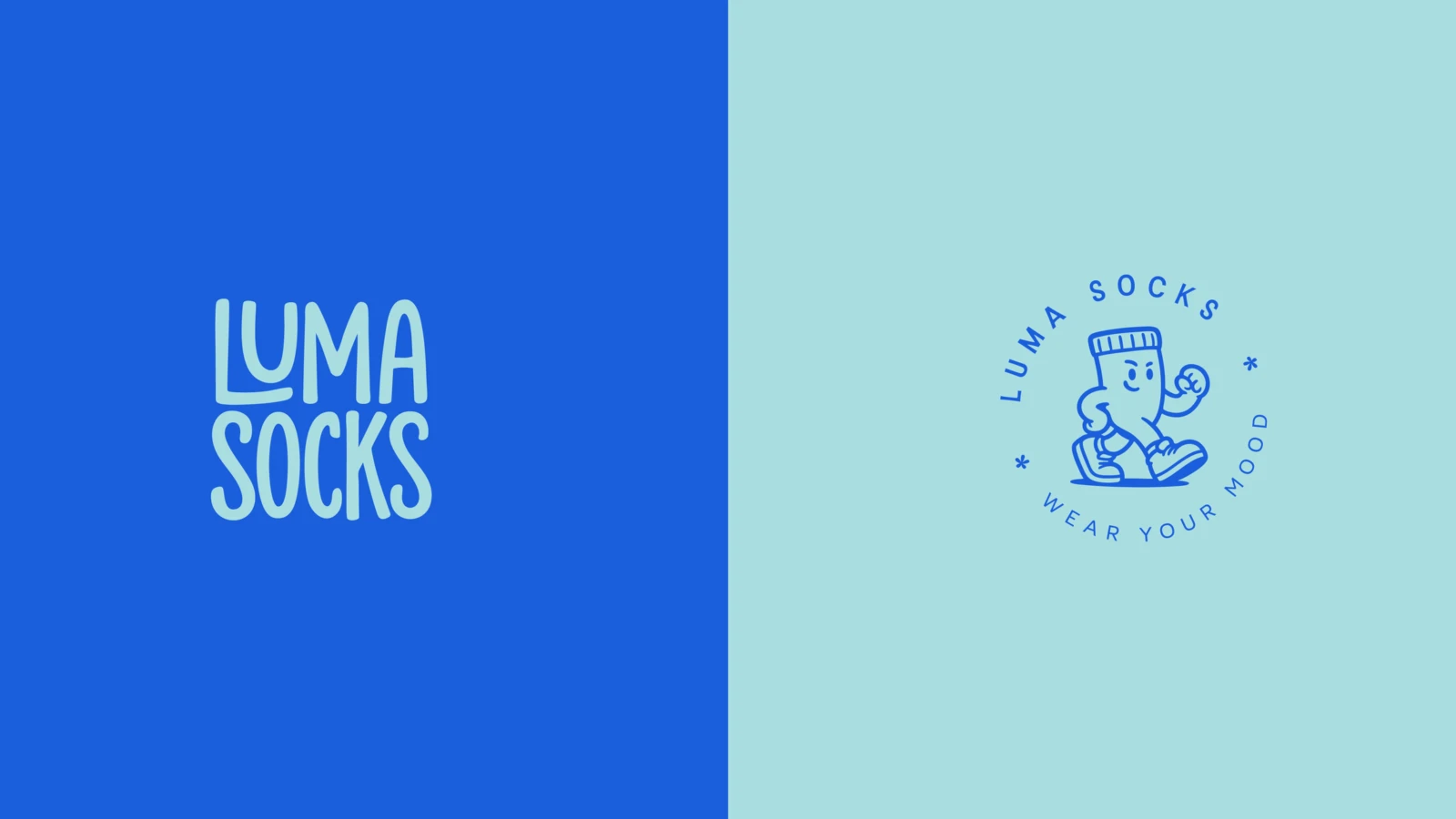
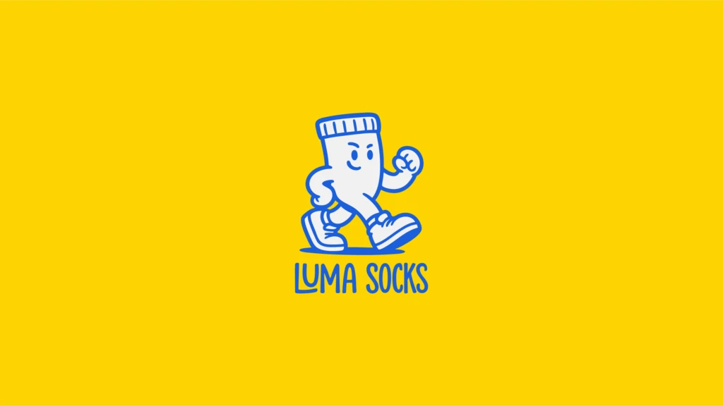
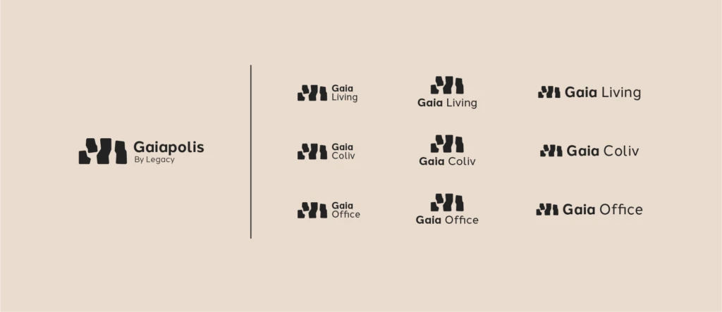
Not one logo but a set: the primary logo, a stacked version, a symbol on its own, a wordmark on its own, one-color versions, and versions for dark and light backgrounds. Luma Socks has a stacked wordmark on blue and a circular mascot badge on aqua; each shows up where it fits best. The Gaiapolis by Legacy logo is drawn from the top view of the four Gaiapolis buildings, and one logo system carries the catalogues, the presentation folders and the construction hoarding.
Color palette
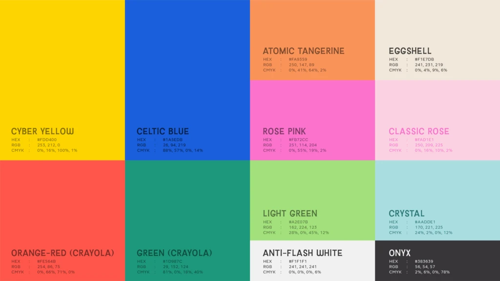
Every color with its name and its HEX, RGB and CMYK values. A screen reads HEX and RGB; a printer reads CMYK. Without all three, the blue on the website and the blue on the box drift apart. The Luma Socks palette page lists every color this way, so a printer and a web developer work from the same sheet.
Typography
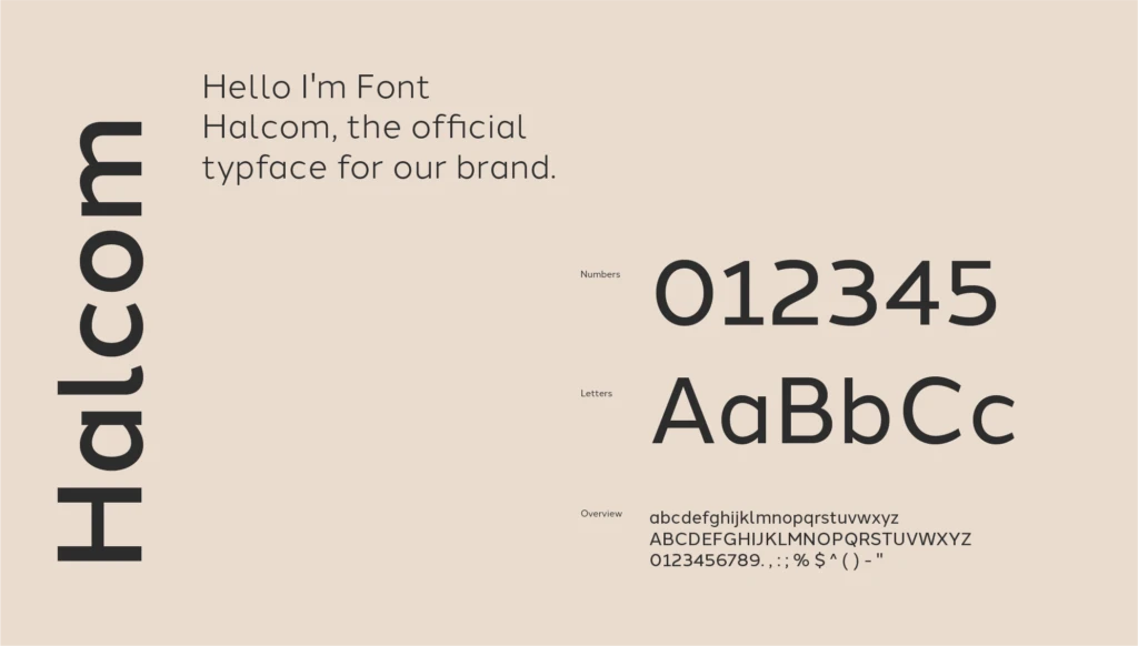
The brand typefaces, the hierarchy (what size and weight a headline, a subhead and body text use), and the licences. Gaiapolis uses Halcom, and the guidelines include a specimen page so anyone setting a catalogue sees how the numbers and letters should sit. Luma Socks pairs Baileywick with Adelphi. Ask who holds the font licence, and make sure it is you.
Graphic elements and patterns
Patterns, icons, textures and illustration styles that extend the brand beyond the logo. Mäyli’s waffle squares and Tissir’s palm emblem inside an archway are both things you can put on a cup, a bag or a storefront when the logo would be too much.
Mascot or character, when it fits
A mascot is not for every brand. For a direct-to-consumer sock brand it made sense: the Luma Socks walking sock mascot works on boxes, on the socks themselves, on social posts and on the website. It gives the brand a face a logo alone can’t.
Applications
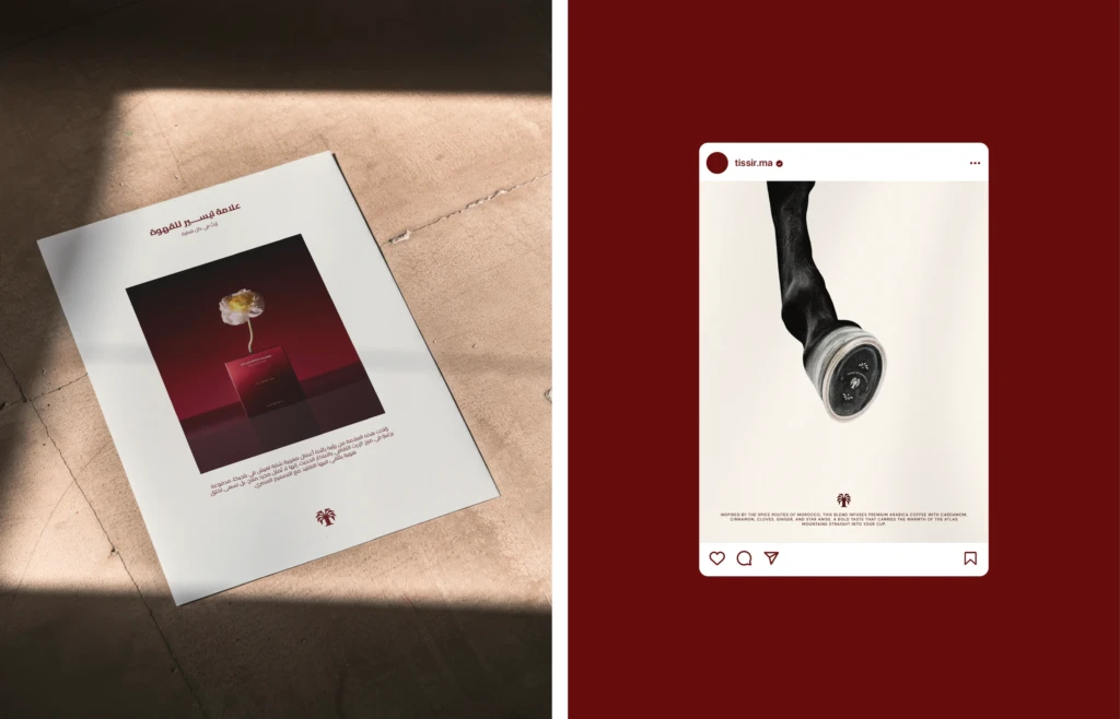
Stationery, social media templates, signage, and packaging for product brands. This is where the identity proves itself. Tissir got cups, cup carriers, boxes, a flyer in Arabic and socks. Gaiapolis got catalogues and hoarding. Mäyli got cups and a storefront. If a brand identity package has never been tested on a real application, it is not finished.
Brand guidelines
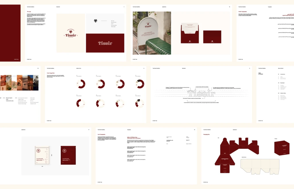
A document that explains how to use all of the above: logo clear space, which version goes where, color values, type rules, do and don’t examples. The Tissir guideline pages carry the logo, colors, typography and the box dieline in one place. We wrote more about this in how to create brand guidelines your team will use.
One identity, several divisions or collections
A brand often grows into parts. Gaiapolis by Legacy covers residential, co-living and offices, so the logo system had to work for Gaia Living, Gaia Coliv and Gaia Office while staying one brand. Luma Socks runs three collections with special edition boxes and 10 sock designs; each box looks different, and they still read as one family. This only works when the identity was built as a system from the start, with fixed elements that stay the same and variable elements that change per division or collection.
Bilingual Arabic and English identities
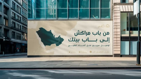
When both scripts have to work as one family, the identity takes more time and more effort. Both languages have to be designed, not just translated. Arabic lettering has its own proportions and rhythm, and a wordmark that looks balanced in Latin letters won’t automatically balance in Arabic. For Tissir, the Arabic flyer sits next to the English box and the two feel like the same brand because they were drawn together. If your brand sells in the Gulf or North Africa, ask for this at the briefing stage, not after the Latin logo is approved. More on this on our visual identity page.
What files and rights to ask for
Everything we develop for a client is theirs. At the end of a brand identity package you should receive:
- Vector masters of every logo version (AI, SVG, PDF)
- PNG and JPG exports in color, black and white, and reversed versions
- Font files or the licence details
- The guidelines as a PDF
- All of it in clearly named folders
What clients forget to ask for: profile picture sizes for each social platform, a favicon, a one-color version for stamps and embroidery, editable templates, and the font licences. Ask for these before the project closes, and ask in writing who owns the final files.
Identity before packaging: why the order matters
A common case: a brand comes to us for packaging, but it doesn’t yet have a brand that can compete in its category, beverages for example. Packaging built on a weak identity can’t compete, however good the box looks. So the identity has to come first.
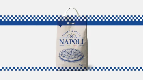
Napoli shows what this looks like. The pizza flour brand’s wordmark, Mediterranean blues and gingham border are one system, and the 5 kg sack, the roll-ups and the billboard all come out of it. If you sell a physical product, read our packaging design page before you brief anyone on a box.
How to brief a studio
You don’t need to prepare much. Just come yourself: the first call is to get to know each other and understand the need, and you don’t need a deck or a mood board for that. Come ready to say what you sell, where you sell it, and who you sell it to. If you have an existing logo, bring it even if you dislike it. If you have a launch date, say so.
Sometimes a client suggests something that would not work for their business. We explain why and propose what will. A good studio will push back; a studio that says yes to everything is leaving you to find the problems later.
Ready to talk about your brand? Start a project with a short brief, or book a call.
Frequently asked questions
What is the difference between a logo and a brand identity?
A logo is one mark. A brand identity is the full system around it: logo versions, colors, typography, graphic elements, applications and the rules that keep them consistent.
What files should I receive with a brand identity?
Vector masters of every logo version (AI or SVG), PDF and PNG exports, the color codes, the font files or licence details, and the guidelines. You should own the final files.
Does a brand identity package include packaging?
Often yes for product brands. Packaging is designed from the identity so the box, label and logo work as one. Ask for it in the brief if you sell a physical product.
Do I need brand guidelines if I’m a small business?
Yes, even a short version. Guidelines are what keep the brand consistent when a printer, a web developer or a new designer touches it.
How long does a brand identity project take?
A visual identity usually takes 4 to 8 weeks. A brand identity with strategy and guidelines takes 8 to 12 weeks. Both depend on scope and how fast feedback comes back.