

Tissir
Heritage in every drop
- Brand Identity
- Packaging
- Art Direction
- Category
- Brand identity & packaging
- Sector
- Coffee
- Country
- Belgium
- Year
- 2025
- Scope
- Identity, packaging system, retail collateral
About the brand
Founded by a Moroccan entrepreneur based in Belgium, Tissir is a specialty coffee brand created to bridge North African tradition with contemporary international design. It launches with a Moroccan-spiced drip coffee collection celebrating the flavor rituals of the Atlas Mountains, calibrated for a global, design-conscious audience. The broader vision expands beyond coffee into a lifestyle universe spanning apparel, design objects, and immersive third-space cafés.
Challenge
The objective was to introduce Moroccan coffee culture to a discerning international market without falling into tourist clichés or generic artisan tropes. Tissir needed an identity and packaging system capable of communicating cultural origin, distinct flavor profiles, and premium craftsmanship. It also had to hold the reductive clarity expected of modern direct-to-consumer brands.
Solution & approach
We crafted a visual ecosystem anchored in the synthesis of Moroccan architectural memory and editorial minimalism:
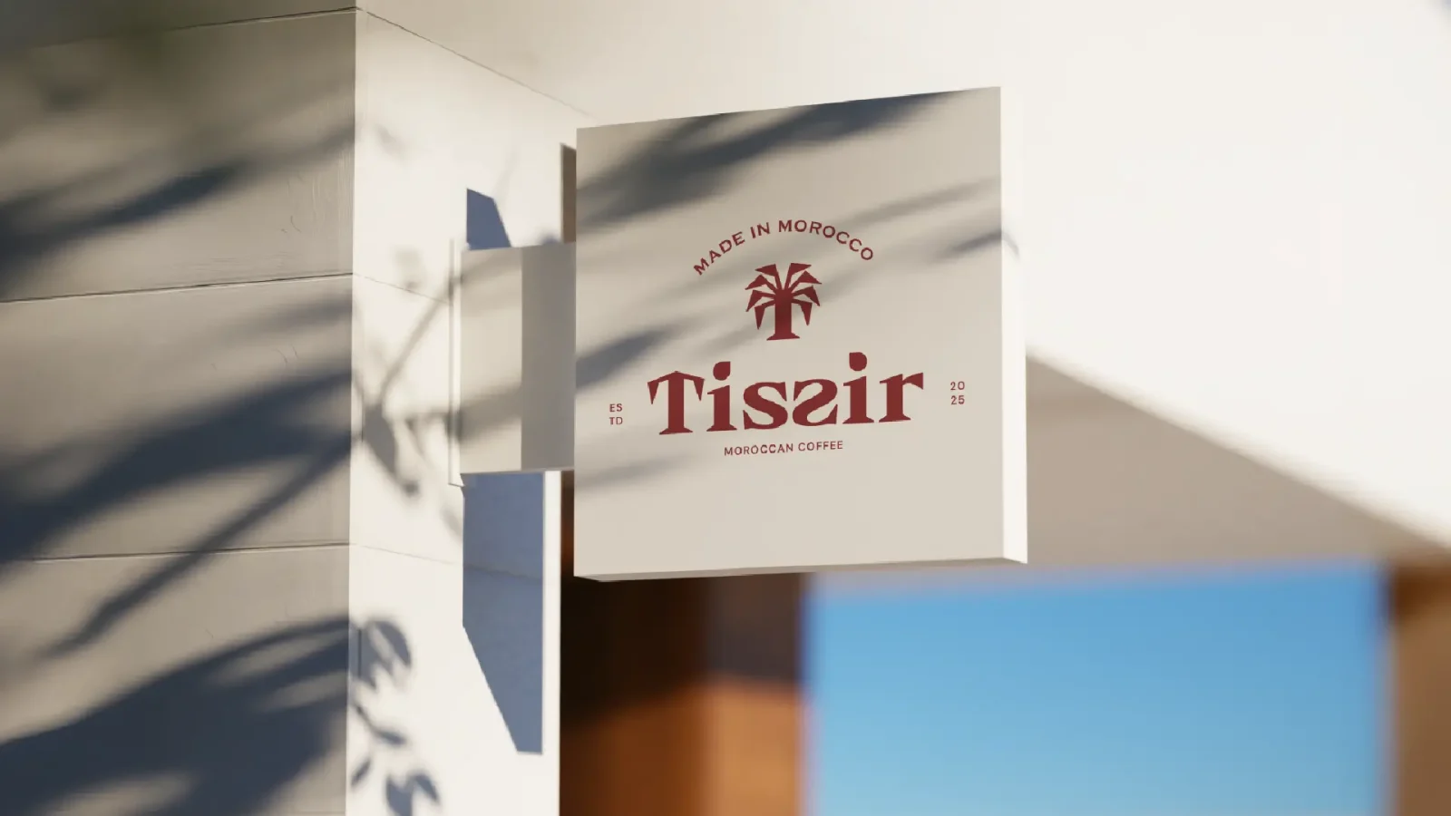
- Custom Logotype & Symbolism: A bespoke wordmark where the capital 'T' draws from traditional Moorish horseshoe portals to symbolize hospitality, paired with mirrored 'S' glyphs that balance heritage with forward momentum, and teardrop tittle accents over each 'i' evoking both botanical seedlings and slow-drip extraction. The standalone emblem combines a reductive date palm silhouette framed within an architectural archway.
- Tactile Packaging System: Built around an experiential reveal - a minimalist exterior in deep crimson or forest green opening onto an uncoated, fibrous warm-dune interior lined with delicate spice botanicals. Angled countertop dispensers hold the single-serve pour-over sachets, sealed with die-cut labels inspired by Moroccan Zellige contours.
- Retail & Brand Collateral: Takeaway cups, carrier bags, and stationery, supported by art direction guidelines spanning chiaroscuro studio stills and sun-drenched lifestyle imagery.
- Typographic & Color System: A disciplined hierarchy pairing Copperplate Gothic and Majesty with DM Sans, set against a landscape-driven palette of Deep Terracotta Crimson, Atlas Cedar Forest, and Desert Sand.
The result is a culturally anchored brand that turns traditional coffee rituals into an internationally competitive lifestyle experience - authentic, modern, and Moroccan by structure rather than by ornament.